- Homepage
 Blog - Tmob | Thinks Mobility
 - Mission: ReBranding21 for Digital Transformation. Accomplished. Get ready for the new era with Tmob!
Mission: ReBranding21 for Digital Transformation. Accomplished. Get ready for the new era with Tmob!
The new logo we launched today is part of our efforts to refresh our look as a whole. We felt the same sentiment for our previous logo from the first day that we started changing the future. Our previous logo has contributed to businesses from a wide range of industries thanks to the hard work of our Tmob colleagues. It is no secret that our old logo was beloved, and we are aware that you felt the same.
The evolution of the products and services that we offer to our customers continues at a pace, and our logo redesign is one of the defining steps towards the future. Our seamless products and mobile financial services solutions help you cater to the needs of your digitized customers and enhance the customer experience. To thrive with digital transformation, we have decided to upgrade to a more minimalist logo.
Before presenting our new branding to you, first, we would like to introduce you to Tmobia.
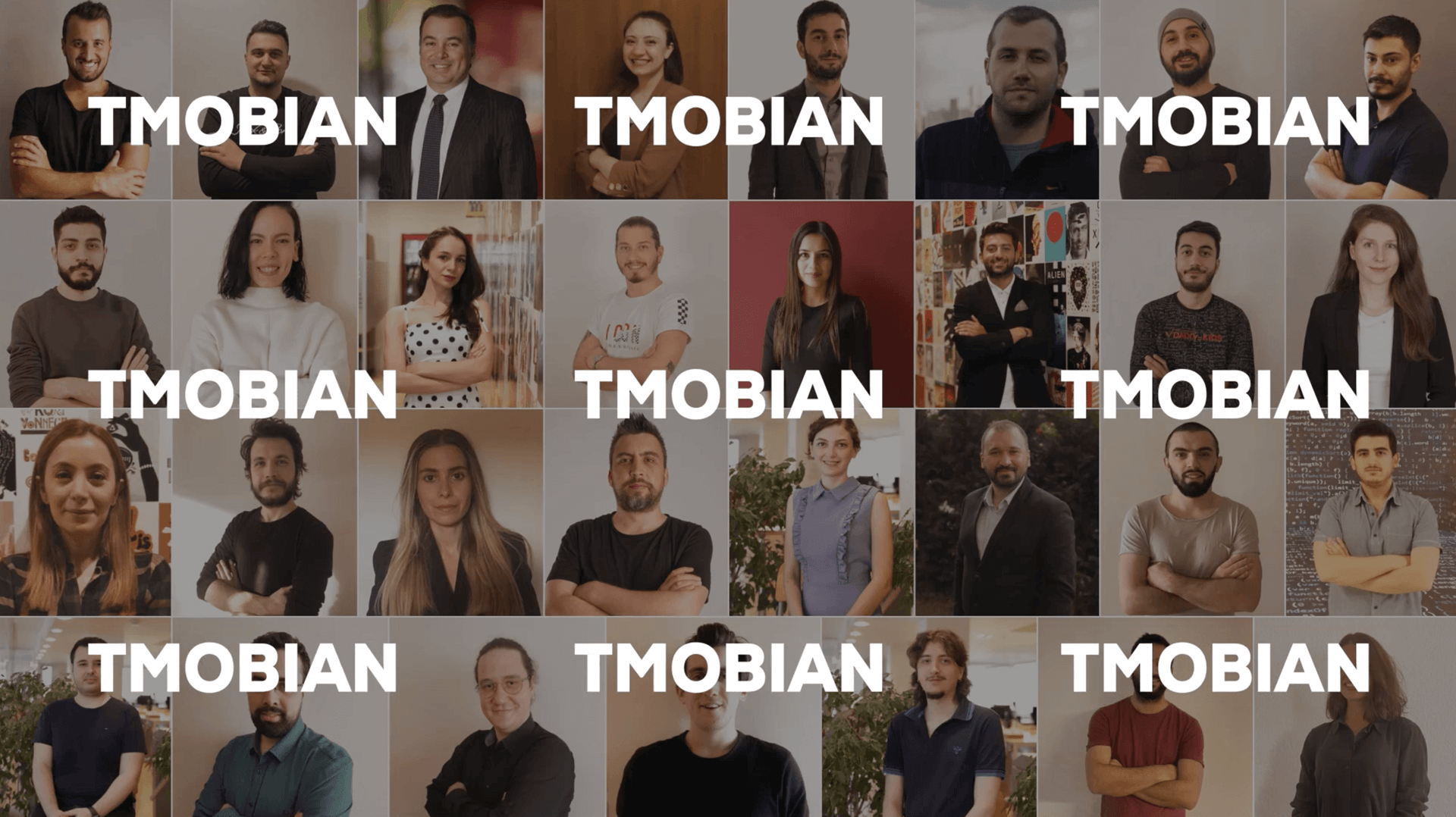
Here at Tmob, we are lucky to have so many inspirational colleagues generating an affirmative impact in our organization around the globe. To honour this positive workplace, we created a term that describes our environment: Tmobia.
Tmobia is a unique world that is filled with curiosity and innovation; a nonhierarchical world that has a spirit of freedom, with extraordinary people who don’t resemble a robot and who try to maintain the work-life balance. In short, Tmobia is a world that aims to constantly reproduce and renew itself. Each of the brilliant talents integrated into this world consists of Tmobian people. These are the people who invent a business on their own and do it successfully.
Tmobians examined over 100 different brand concepts before we finally settled on a logo. During this process, since we know the importance of each Tmobian’s opinion, we collided our thoughts in a democratic atmosphere at each point and came up with this design together. Here is the new TMOB!
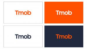 TMOB is not just a futuristic company; it is also an entire universe for developers, designers, engineers, marketers, and so on. Now is the time to crank targets up a notch. Throughout the digital transformation journey, our brand-new neat, energetic and optimistic logo will accompany us. We decided to spread orange to every pixel of our new logo instead of packing it into the “t”.
The point of this blog post is not to explain the design and meaning behind every angle and curve in the new logo; it is to give a shout-out: Same quality, brand-new look.
Now is the time for you to become a part of our excitement. We are making an influential leap into the future today. We are strengthening our brand with the new logo because it symbolizes our commitment to continually evolving to help our audiences connect with a globe that is constantly in a transformation. Our passion will be evident in our current blogs which we will keep on publishing on LinkedIn, Twitter, and in our visuals where we present scenes from the TMOBIA universe on Facebook, Instagram, and Youtube.
🧡 It’s still us. We’re still Tmob – Thinks Mobility. But more cohesive and hopefully more instantly identifiable. 🧡
TL;DR: We changed the logo (Press Kit), font (Nexa Bold), and color (#FE5000). 😊
Love from Tmobia. 👍
Related Posts


Why Express Order Delivery is Crucial for E-Commerce
Increaisng demand is express delivery is Crucial for E-Commerce . The e-commerce industry is an exponentially growing trend.
The Increasing Power of Open Banking
Everybody is aware of the Increasing Power of Open Banking is of the fact that the future of banking is digital: De-Fi, open finance & data.

Challenger Banking 2.0: Branchless Banks are Here to Challenge the Big Four in the UK
Branchless banks are challenging the challenger banks in the UK. Here are some insights to join the digital fintech revolution. Challenger Banking: Branchless Banks are Thriving in the UK.


